Why do so many people switch to dark mode the moment it’s available? It’s not just a matter of taste. From eye comfort to device battery life, dark mode is slowly becoming the default for millions of users worldwide. And if you’re designing anything digital in 2025, there’s no way around it: understanding the rise of dark mode is no longer optional.
Dark mode isn’t just a design trend anymore
We’ve moved past the stage where dark mode was a “nice-to-have” feature. It’s now an expected option. On most modern devices, users can switch between light and dark interfaces based on time of day, personal preference, or accessibility needs. For designers, this means creating interfaces that perform just as well in the dark as they do in the light.
There’s also a clear reason for its popularity. In low-light environments, dark backgrounds put less strain on the eyes. On OLED and AMOLED screens, dark mode can even extend battery life because black pixels consume less power. As more devices adopt OLED technology, battery savings become a strong incentive for users.
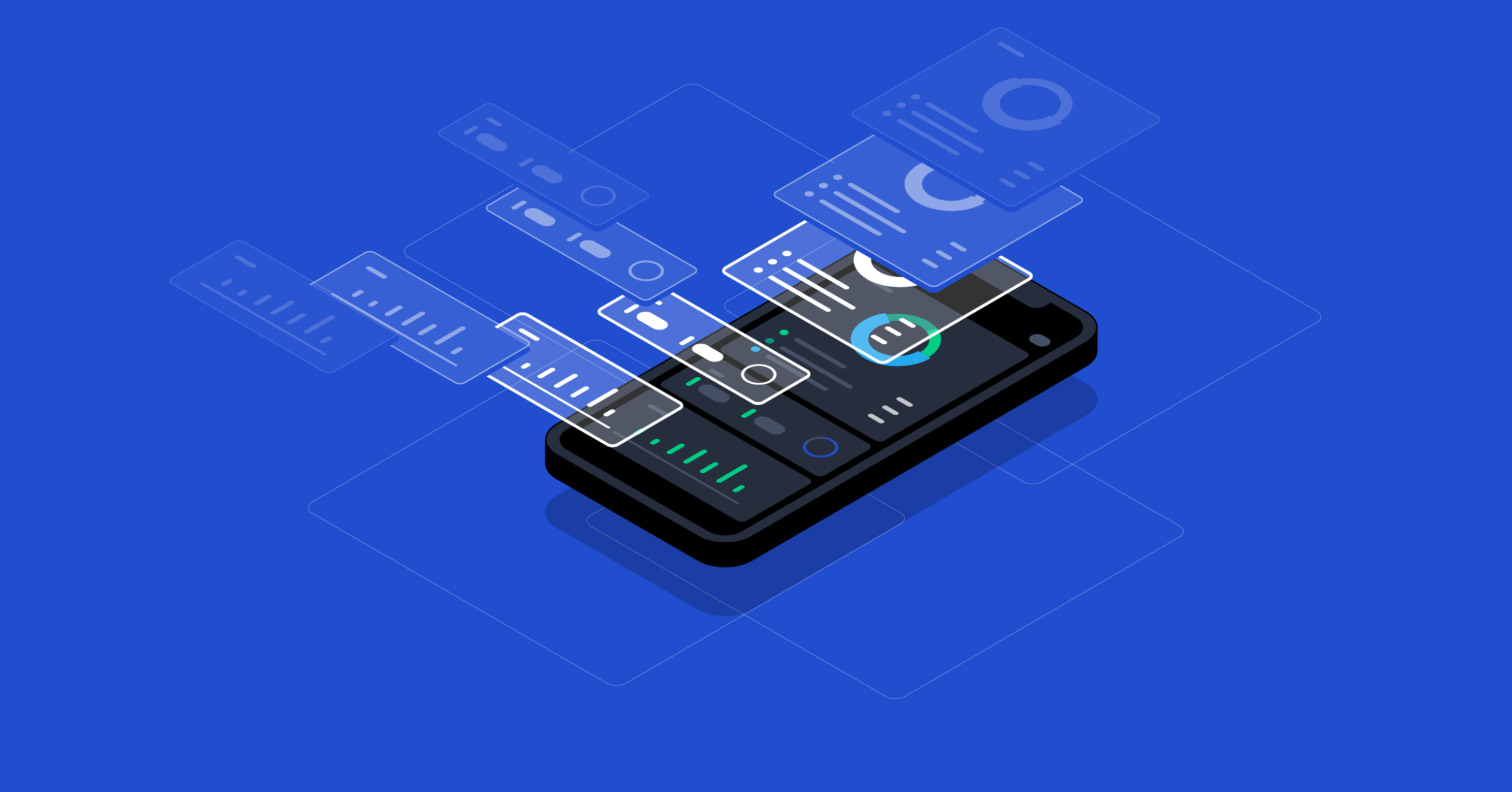
Designing for dark mode isn’t about inverting colors
When people hear “dark mode,” they often imagine simply reversing light colors into dark ones. But effective dark mode design requires more nuance. Black-and-white contrasts can be harsh. Instead, designers use softer shades of grey and off-white. This creates a more balanced contrast that is easier on the eyes.
In practice, that means replacing pure white text with soft whites or light greys, and using dark greys instead of pitch-black backgrounds. Too much contrast can create visual noise. Not enough contrast, on the other hand, leads to readability issues. The sweet spot lies in thoughtful adjustments and extensive testing.
Color behaves differently on dark backgrounds
If you’ve ever looked at a neon color on a black background, you know how loud it can appear. That’s because saturated colors stand out much more in dark mode. Designers often need to tone down bright colors when working with darker palettes.
Highlights, gradients, and textures also become more important. Shadows don’t show up the same way they do in light mode. To create depth, designers have to lean on alternative tools like glows, gradients, and spacing. Typography, too, requires extra care. Fonts may look bolder or more prominent, depending on color combinations.
Dark mode accessibility isn’t optional
In 2025, accessibility isn’t just about meeting standards—it’s about inclusive thinking. While some users love dark mode, others find it more difficult to read. Light text on dark backgrounds can cause blur for users with astigmatism, for example.
That’s why designers need to offer both modes, ideally with a system-level toggle or a manual switch inside the app. But more than just toggling between modes, it’s important to maintain a consistent user experience. Fonts, buttons, icons—everything needs to remain intuitive, familiar, and legible across themes.
Context matters more than ever
Not all environments call for the same approach. In a corporate setting, dark mode can feel too informal. In gaming, it’s the norm. Social media apps often let users pick a mode depending on time of day.
And region matters, too. For example, in cities like Istanbul where evening usage spikes during winter months, dark mode adoption may be higher. We’ve also seen that productivity tools in Turkey are increasingly launching with dual-mode compatibility.
We should also consider cultural preferences. While some users value aesthetics, others prioritize efficiency. That’s why offering choices—and tracking how users interact with them—helps developers design better apps.
Implementing dark mode in your product
If you’re starting from scratch, include dark mode early in your design system. Think in pairs: every element in light mode should have a corresponding element in dark mode. Colors, icons, images—even logos—may need adaptations.
When retrofitting existing apps, it’s crucial to audit all UI components. You’ll likely find assets that don’t translate well. Replace PNGs with SVGs, use CSS variables for color themes, and update brand elements to suit both modes.
More importantly, test everything. Real-world usage reveals what design systems cannot anticipate. Invite users into beta testing groups. Monitor feedback actively. Tweak and refine. The best dark modes are never static—they evolve based on user input.
Dubai-based companies are setting the tone
Tech teams in Dubai are fast embracing dark mode in health, fintech, and real estate apps. Leading medical platforms now offer night-friendly dashboards for physicians working long shifts. Real estate portals are integrating dark mode for agents navigating listings on mobile late at night.
Even government services are starting to follow suit. While the Dubai Health Authority’s website hasn’t fully shifted, mobile health tracking apps often launch with dark mode by default. These shifts indicate a broader institutional move toward visual comfort.
Why every designer should care about this
There’s no escaping the fact: users expect dark mode. Ignoring it means alienating a large part of your audience. This applies not just to tech giants, but also to smaller startups, e-commerce sites, and local apps.
If you want your product to feel modern, adaptive, and user-centric, dark mode is a baseline expectation. And the more polished it is—visually consistent, accessible, and well-tested—the more it signals professionalism.
As highlighted by www.too.ae editor, a great product isn’t just beautiful. It adapts to context, light, mood, and use. And right now, that includes the dark.
Dark mode is about mood as much as function
There’s also something intangible about dark mode—it feels different. More intimate. Calmer. Focused. It changes how we perceive content and how long we want to engage with it.
This matters for retention. If a user feels more comfortable, they stay longer. They scroll more. They interact. That’s a major reason why social platforms, media apps, and e-readers are pushing for dark-first design.
In short, dark mode isn’t a passing style. It’s a usability feature, an aesthetic choice, and a business decision all rolled into one. And it’s not going anywhere.
We’ve embraced dark mode in our own design work at **www.too.ae**—not because it’s trendy, but because it works. For the user, for the product, and for the long haul.
best website design in dubai / best website development in dubai